Australian government data says national greenhouse gas emissions have come down steadily over the past two decades and are now 29% less than in 2005.
But another calculation, based on the government's data, says the emissions that matter have barely moved, dropping only 2.5% over that time.
Some analysts believe the second calculation is the true measure of Australia's heat-trapping pollution – and that it reveals how little has been achieved in cutting CO2.
What should we make of this? In the charts below we explain Australia's progress in cutting greenhouse gas emissions and the latest on what's happening with the climate crisis.
Australia's ‘fair share' of emissions
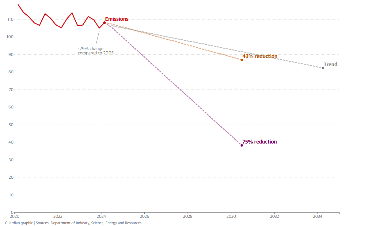
Australia has a legislated 2030 emissions target: a 43% cut compared with 2005 levels. Government projections released in late 2023 suggest the country is slightly behind the pace necessary to meet this target.
But the analysis doesn't answer a key question: is 43% enough?
The carbon budget countdown clock below shows how long Australia has left on the current trajectory until it has emitted its "fair share" of future emissions.
You can toggle between calculations of Australia's fair share in limiting global heating to 1.5C and 2C, the two thresholds mentioned goals in the landmark 2015 Paris agreement.
For 1.5C, the country is likely to have emitted its fair share before 2030. For 2C, it is likely to reach that level between 2030 and 2040. Scientists warn there will be a significant and devastating difference in the damage caused by heating of 1.5C and 2C.
What Australia emits
According to the latest national greenhouse gas inventory, national emissions decreased by 0.5% in the year to December 2023.
As mentioned above, the government says over the longer term – since 2005 – national emissions are down 29%.
But this is only true if you include changes in emissions from forests and the land in the calculation, and this is a contentious point.
You can see this by toggling in the chart above to exclude emissions from what is known in carbon accounting as "land use, land-use change and forestry", or LuluCF.
Australia's quarterly greenhouse gas emissions and projections compared to targets
Showing Australia's actual quarterly emissions (in millions of metric tonnes of carbon dioxide equivalent), the trend since 2005 and lines representing 43% and 75% reductions from 2005 levels. Use the toggles to include or exclude land use change (LuluCF) and expand the chart to show since 2005
Emissions from forests and the land are affected by natural factors and work on a different cycle to industrial pollution. They are also difficult to estimate.
Some scientists say including them in national emissions accounts masks what is happening with fossil fuel use, the main driver of the climate crisis.
Some countries don't include LuLuCF emissions in their accounting. Australia does. If it didn't, its greenhouse gas inventory would tell a different story.
Emissions from across the Australian economy (including electricity, major industry, transport, agriculture and waste) are down only 2.5% since 2005.
Analysts say little of this change in LuLuCF is due to climate policy. Some was caused by changes in state laws to reduce land-clearing for farming and some was due to a decline in native forest logging.
And there is significant uncertainty about just how much emissions from these sources have changed.
Government estimates of Australia's historic emissions are adjusted each year. This is particularly the case for LuLuCF, which is difficult to estimate.
The government keeps revising Australia's historic emissions
Showing historic greenhouse gas emissions by year the dataset was released. Data is in millions of metric tonnes of carbon dioxide equivalent
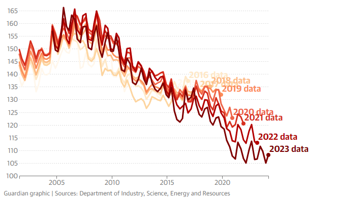
The chart above shows the changes over the past nine years.
Analysts have noted that the revisions have made it significantly easier for Australia to meet its emissions reduction targets than it otherwise would have been.
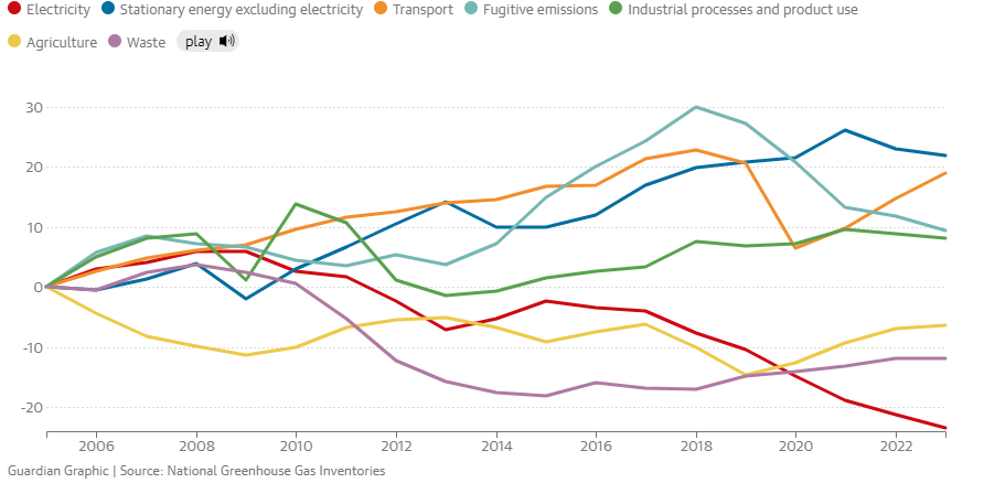
The next chart shows the change in emissions in all sectors other than LuLuCF since 2005.
Pollution from electricity generation has fallen in the past year, continuing a long-term trend. It was 2.8% lower than the previous year due to solar and wind energy displacing coal and gas.
Fugitive emissions from coal and gas extraction were down 2.1% and emissions from stationary energy – fossil fuels in industry other than electricity and transport - dipped by 0.8%. Both have started to come down after rising substantially since 2005.
But emissions from transport jumped 3.6%, in part because people were driving and flying more after Covid-19 restrictions. They are rising far more than emissions from any other sector.
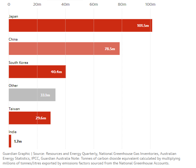
Estimated combustion carbon emissions for Australian exports, by destination country
Showing the estimated combustion emissions (tonnes of carbon dioxide equivalent) exported, by country and fossil fuel. Data from the 2022–23 financial year
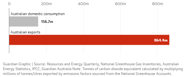
Estimated combustion carbon emissions for Australian black coal in 2022–23
Showing the estimated combustion emissions (tonnes of carbon dioxide equivalent) exported and consumed domestically from black coal. Data from the 2022–23 financial year
How Australia compares to the world
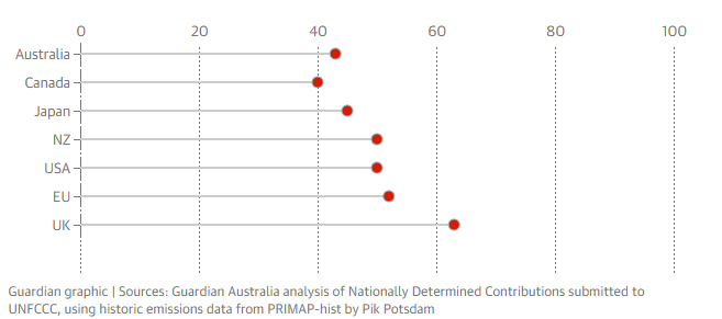
Australia's emissions reduction target for 2030 has increased since the Albanese government was elected in May 2022, but it remains behind most other similar countries.
2030 emissions pledges by jurisdiction
Shows the percentage reduction on 2005 emissions pledged by country or region, based on submissions to the UNFCCC. Australia's target includes land use change (LuluCF)
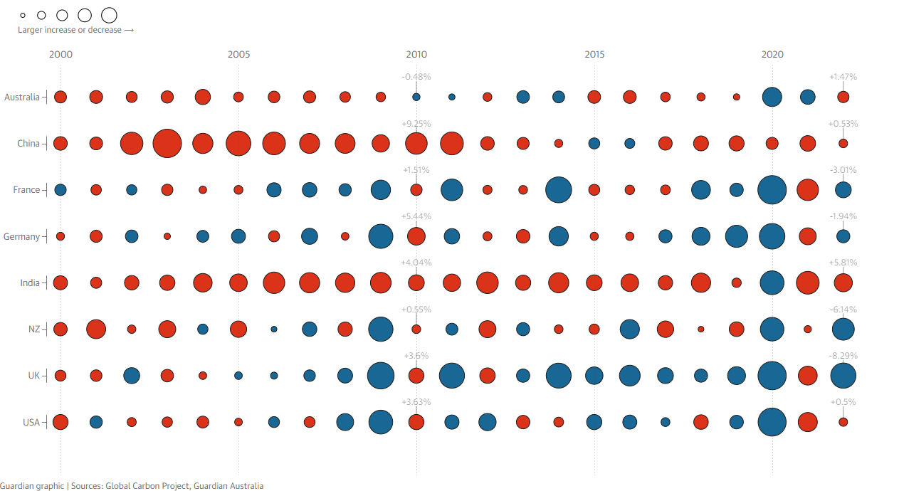
This chart shows how emissions have changed year-by-year from some developed countries since 2000. Emissions from LuluCF (landuse change) are not included – reflecting that many countries do not use them.
Red denotes increases and blue shows decreases. Australia's emissions mostly increased or stayed about the same until Covid-19 hit.
Yearly change in greenhouse gases emitted, by country
Shows the increase or decrease in territorial emissions of Co2 equivalent from the previous year since the year 2000. Does not include land use change (LuluCF). Latest data as of 2022.
This next chart shows how much different countries emit per capita. The deeper the red, the more the pollution.
Global heating is here
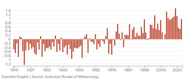
The Australian Bureau of Meteorology says the average land surface temperature across the country has already warmed by about 1.5C since 1910.
The graph below shows the change in average Australian temperatures since early last century.
Australia is getting hotter due to global heating
Showing the average temperature anomaly (in degrees celcius) since 1910. The temperature anomaly is the difference in average temperature for a given year compared with the long-term average. Latest data as of 2023
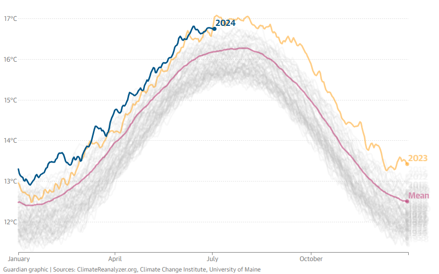
The next chart shows the change in daily average global temperatures over time. It is derived from a model based on observational data from weather stations, balloons, satellites and other sources.
It shows 2023 was a record-breaking year for average heat, and 2024 has so far been hotter again.
Average global temperatures
Showing worldwide average air temperatures in degrees celcius. Mean is for the period 1991-2020. Last updated 9 July 2024
The next chart shows sea surface temperatures from the past couple of decades, using the daily average.
Scientists say the ocean absorbs most of the heat – up to 90% – reflected back to the Earth by greenhouse gases in the atmosphere.
Notes and methods:
- The trend in the quarterly National Greenhouse Gas Inventories is an exponentially weighted moving average from all data from June 2005 onwards.
- Percentage decline since 2005 based on a comparison of the emissions in the year to the latest quarter compared to the emissions in the year to June 2005 and does not account for seasonality.
- Emissions values are based on tonnes of carbon dioxide equivalent greenhouse gases (AR5 values).
- Carbon clock uses the "fair share" carbon budget as a baseline, originally calculated as 10,400,000,000 tonnes of CO2-e between 2013 and 2050.
- Guardian Australia uses the quarterly National Greenhouse Gas Inventories to calculate emissions since 2021, creating a daily average from the previous year to calculate how much longer before the fair share threshold is breached.
- Carbon clock uses one second ticks based on the greenhouse gas emissions from the previous year.
- Per capita greenhouse gas emissions by country are based on the latest release of the Global Carbon Budget from the Global Carbon Project.
- Estimated combustion greenhouse gas emissions from Australian fossil fuels are calculated using production and export volumes from the Australian Resources and Energy Quarterly.
- Domestic consumption of black coal is estimated by subtracting annual exports from annual production.
- Volumes of fossil fuel exports are converted into energy units using factors from the Australian Energy Statistics.
- Emissions factors for energy from fossil fuels are calculated using figures from the Intergovernmental Panel on Climate Change.
- Thanks to Tim Baxter for providing feedback on several graphics. Any errors remain the fault of the authors.
Source: The Guardian – URL: https://www.theguardian.com/environment/datablog/ng-interactive/2022/oct/03/tracking-australias-progress-on-the-climate-crisis-and-the-consequences-of-global-heating